Sometimes certain trends are grabbed by many homeowners, and before you know it they are everywhere and you may begin to feel like you have reached your viewing saturation point. I get this feeling a lot on Pinterest. It might be a pattern, a wall treatment or specific fabrics. I find myself thinking... please no more.
Does it really matter to the average homeowner?
Only you can answer that question. I'm not censoring what a homeowner chooses to use to decorate a home. Rather I am just commenting that certain design decisions seem to be very overused, and as a result if you want to have a home that is a little unique or individual, these design decisions are probably not the way to go.
Chevrons
I have always been a lover of geometric prints. There was a time when I loved chevron designs, but that affair has ended! Too bad I have to say good-bye; perhaps in ten years we will have a reunion.
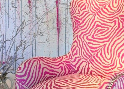
Animal prints
I have to work hard to warm up to animal prints, but I agree that their organic spots and stripes are very interesting when you want to include patterns in a room. Maybe one or two animal prints might be good, but more than that becomes overdone. I like to introduce them using small items like a box or a pillow because they are easier to replace when you get tired of them.
Blackboard walls
Having been a teacher, I left blackboard walls behind years ago. I think they work well in a child's playroom or bedroom because they serve a functional purpose, but they are dusty. Think about allergies too. There is something messy and not quite right about them in main rooms of a home.
Gallery/salon walls
I love smaller gallery walls that are very organized. Too many items and you end up looking at the organization (or lack thereof) and not the individual pieces of art.
Baskets everywhere
I have baskets in my home here and there because they are functional, but I am always careful not to overdo it. I don't want someone to walk in and think ... the house of baskets.
Text as art
Yes, I like quotes, I even collect them and I love text. Their use as art just seems to be way overdone in the last few years.
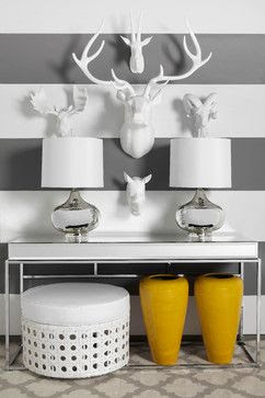
Faux taxidermy
Here's another design motif that when used in the right setting added an individual note to a space in the past, but not anymore because faux taxidermy is everywhere and I am still trying to figure out why. Are you a lover?
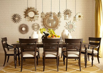
Starbursts
Large horizontal stripes
When this image first popped up on Pinterest I was attracted to the strong graphic nature of the stripes. Very quickly bold, equally sized and spaced stripes were popping up everywhere especially black and white ones. Nothing was sacred as they appeared on walls, rugs, pillows, tables etc.
And how about you? Do you have design elements or objects that you think need a rest? Perhaps you love some of my "tired" choices and want to argue for their continued use.


EmoticonEmoticon